Last year we added our "story swarm" data visualisation to Care Opinion, to help you see your stories over time.
In the story swarm, each circle represents a story, and the colour represents either story progress or criticality, as you choose.
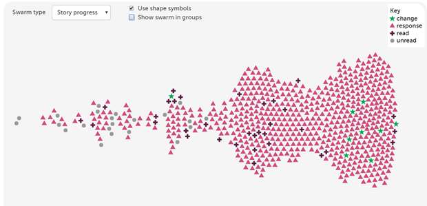
Some subscribers told us that the different colours were not easy to tell apart if you have colour-blindness, or if you print the swarm out.
So we've recently updated the story swarm to add another option: you can have different symbol shapes, as well as different symbol colours, like this:
Of course, you can also still separate the symbols into groups, for extra clarity.
Hope that's helpful! Do let us know if you find other ways we can improve accessibility and make Care Opinion easier for everyone to use.
Our story swarm is now a bit more accessible
Our story swarm is now a bit more accessible https://www.careopinion.org.uk/resources/blog-resources/27-images/b1d53c4d3b91438b81ff770dfad5b7b2.png Care Opinion 0114 281 6256 https://www.careopinion.org.uk /content/uk/logos/co-header-logo-2020-default.pngChange from Care Opinion tech
Posted by James Munro, Chief executive, Care Opinion, on
Thanks for your feedback.

