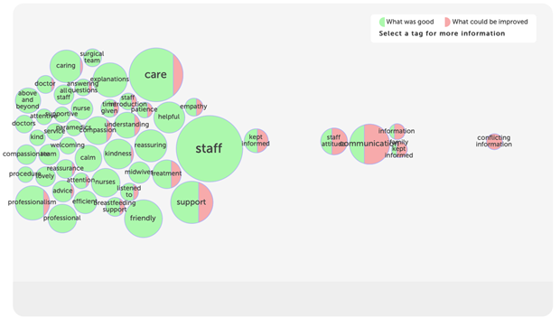
Tag bubbles
This shows the most popular tags for your stories as bubbles. The bubbles are split according to how often the tag is used to say "what was good", or "what could be improved".
This visualisation provides a lot of information in a very easy to understand way.
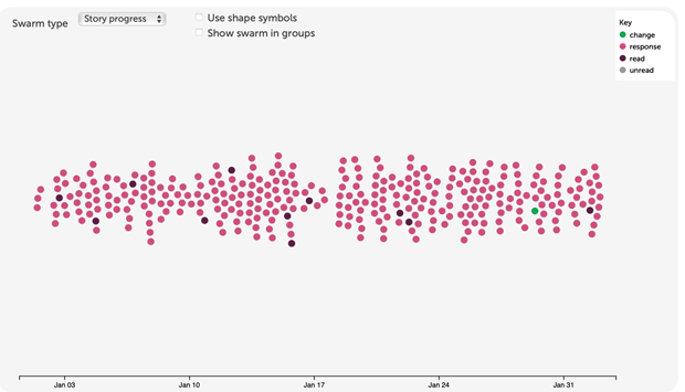
Story swarm
This shows how your stories are spread over time and allows you to see patterns in story progress or criticality. Up to 400 stories are included.
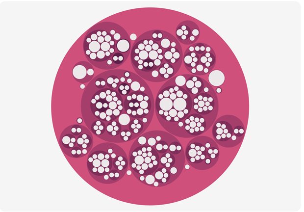
Lily pad
This shows how your stories are spread according to the services they relate to.
Each circle represents an organisation or the service it provides. The more stories about a service, the larger the circle for that service.
Some stories are about multiple services, so you may see services outside your own subscription scope on the lily pad.
Sunburst
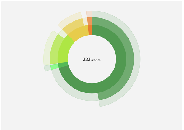
This shows how stories progress: each ring represents a step on the journey from being told to being read, responding to and perhaps leading to change too. Stories are grouped by criticality.
Tag word cloud
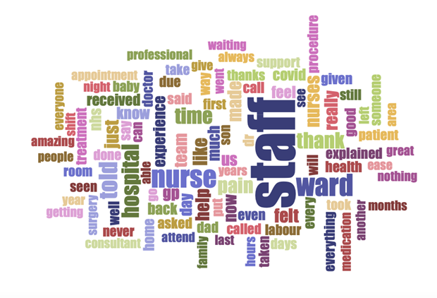
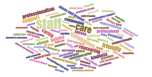
This shows the most popular tags for your stories as words, sized according to use.
There are three variants of this visualisation: you can choose to display tags people used to say "what was good?", "what could be improved?" or "how did you feel?"
Story word cloud
This shows the most commonly used words in the text of your stories, based on the last 100 stories.
